

Thanks to some Photoshop wizardry and a great shower curtain find, I think I’ve made a decision on the bathroom’s color scheme. I know you’ve all been on the edge of your seats…. how exciting, right?
The basics:
We’ll be painting the vanity (too lazy to strip it) so I had to choose a color for that. We’ll be doing the cheaper by-the-sheet beadboard due to budget constraints, so that also needs paint. And then of course the walls. And all this needs to match a shower curtain that we can afford and find two of (because of the clawfoot needing a curtain on both sides).
The color schemes:
I found a very pretty paisley print curtain at Kmart the other day – on sale even – so I brought two home. I forgot that Kmart carries the Martha Stewart Home line, which is actually adorable despite the nastiness of the Kmart store itself. The green is very similar to that used in our kitchen, and the warm rich hues would echo what’s going on downstairs color-wise.
If we use these curtains, I’m leaning toward a tan/beige for the walls and the vanity, with everything else a neutral white or off-white. And I’d use a wooden mirror of some kind. Kinda like this:
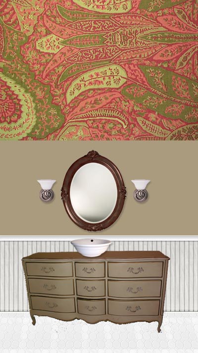
That’s the curtain pattern on the top. Ignore the light fixtures, they’re just for placement because we haven’t chosen lights yet. Also ignore the somewhat shoddy Photoshop job… I only have so many hours in the day, and Christmas shopping is taking priority over color scheming this week!
The beige one feels the most homey and historic to me. We talked about painting the vanity black, but it ends up looking very contemporary in the mockups. IÂ whipped up a few other options that I thought I’d share, since we’re really not dead-set on any one scheme right now. We welcome your thoughts and opinions!
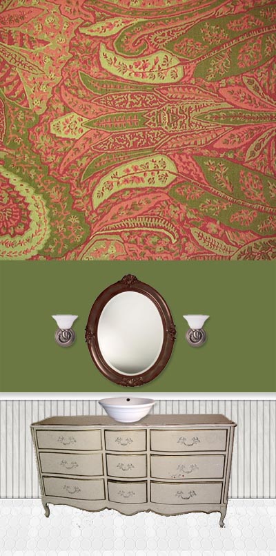
Here’s a light green/white version:
Here’s a darker green with a black vanity and black mirror:

And last but not least, an airy blue with a totally different shower curtain from Pottery Barn. I’m feeling paisley right now, for some reason.

I’d like to use milk paint for the vanity; one of our readerws, Erin, suggested this and I’ve always wanted to try it. Before paint was available commercially, milk paint was made at home by resourceful DIY’ers just like us. In fact, you can even find recipes online for making your own. All of the recipes involve milk and lime, along with some form of pigment or dye. That’s a little rustic for me – I imagine it’d take some time to get things just right. Luckily, a few reputable companies sell their own versions online. Erin vouched for the product available at http://www.milkpaint.com.
I’ve seen milkpaint furniture in shops and boutiques. The finish is so velvety, and the hues makes everything feel old and authentic. It’s also not loaded with chemicals, so it won’t produce fumes that’ll drive you out of the room. You can mix/match and layer colors, so we could get a nice beige by adding a little something to white.
The only downside I can see to using milkpaint is 1) having to order it, and wait for it to get here and 2) having to prep the vanity with a good (somewhat expensive) bonding layer (because it won’t stick well to any coating other than clean wood). The closest dealer is about 2 hours away, but that is an option for getting it without shipping fees and extra waiting time.
More decisions……..
Anyone want to throw in their opinions on our color schemes and/or the milk paint idea? Fire away!
Comments, Thoughts, and Feedback
My vote is for 1,3 & 4.
Narrowed that right down huh?!
At the risk of sounding contrary, I love #2, hate the rest. Guess it’s your call.
I’m going to go with #3 (#2 is my second choice) for the color. It’s actually really close to the color scheme we’re using for our master bathroom, so it was an easy choice. I think #1 is too understated for my taste (though a good, solid traditional color) and #4 is too cool. It makes me think of snow and ice. I’m thinking green and a soak in a hot bath would be more relaxing.
As for the milk paint and the company, it’s great stuff. I don’t know if you’ve read The Devil Queen lately, but I recently (November?) had a how-to post on it. The trick to it is to make exact measurements of paint-powder to water (one to one) and only mix as much as you’re going to use in one application.
The company is great, no problems with them at all. Our paints were shipped to us and we received them within a week.
If you have any questions about milk paint, email me at thedevilqueen(at)hotmail(dot)com.
Well, I’m no fixer upper and I know nothing about to make things look authentic and historical. But I do like pretty things, and I thought #3 and #4 were rad. I enjoyed #2 more than #1 because of the brightness of the walls.
I like the way the vanity looks painted black, but I’m pulled towards the stark contrasts of “mod” looks. It will look so awesome no matter what you choose though. I love that vanity. Such a great find.
I love the last one. The blue, white and black. It looks crisp and clean and I love blue in bathrooms. I cannot wait to see it and meant to leave a comment yesterday about the tub. It’s gorgeous!!!
Well gee, let me just pop in here and really muddle things up!
I like your #1 choice, but I also really like #3. Both of these seem very warm and relaxing to me.
Number 2 isn’t appealing to me because the vanity color doesn’t look right with the white bead board, to me.
While #4 is pretty…it is a very cool palette and doesn’t give me that “ahhhh, nice, soak in the tub” vibe I’d want with a claw foot tub in the vicinity!
The shower curtain is very pretty, love it when the price is right! The Martha Stewart line (though I’m no fan of Mz Uptight lol) is KMarts only saving grace.
Whatever you decide I’m sure it’ll turn out fab.
Merry Christmas!
I have a bedspread in this pattern. I’ve had it in a room with tan walls with a coral accent wall, and what I like the best is the contrast between it and the light sage walls that I have in my spare bedroom. Here is a link- some pictures show the color better than others:
http://nightmareonelmst.net/2005/07/16/guest-bedrooms/
My favorite is #3. The wall and vanity colors are nice in #1, but I don’t think they play off the shower curtain as nicely. In any case I’m sure it will look good!
Completely unhelpful, but I like all of your choices. I look forward to seeing what you decide.
I like the black vanity and #2 color scheme. How’s that for mixing it up? Not good. When I had this problem I would scout out pictures from Victorian Homes magazine or go to Barnes and Noble and look up all the victorian books with pictures that I could before my head exploded! Glad to help…
Number 4 , the blue is definitely the most sophisticated. Green is NOT a good color for a bathroom, I have found. It makes your skin look bad.
I prefer numbers one or three. The neutrals in number one would allow you flexibility, were you to tire of the paisley at some point (and I think candlelight would look lovely against it during those long soaks).
Ok, now my choice is harder than ever! I appreciate all the input though. It seems our original idea, the green, is favored by most. We might have to try that out! We can always paint over it if we find it’s not working. We do that quite often around here.
Thanks, John, for the info on milkpaint – I think we’re going to go ahead and order some as a “Christmas gift” :)
Amanda, great pics – I love seeing that color with the actual fabric, it looks great!
I vote 1 and 4, especially 1. I agree that the black vanity looks a little more modern.
Casting a late vote — also a fan of #3, but we tend to paint the bathroom whichever color is most flattering to our skin tones so that we don’t spend the mornings depressed.
In addition, I’ve had the clawfoot tub, and have found that three shower curtains are infinitely better than two, just in case there are some left at KMart.
i vote 3-4 i agree 4 maybe too cool nice in summer but in the winter prob not a good choice, but then green is my fav color , something about the black vanity very cool
We love to hear from you, dear readers.